This post was originally written by Cassie Nooyen on https://techbar.crnooyen.knight.domains/
There are features in Google Chrome that can be very helpful while designing your domain, but they may be unknown for many.
Responsive View
This feature allows you to see how your website will look at a variety of widths and on different devices.
To find this feature, right-click anywhere on your website, and near the bottom, there will be an option called Inspect. You can also reach this by using the keyboard shortcut Ctrl+Shift+I.

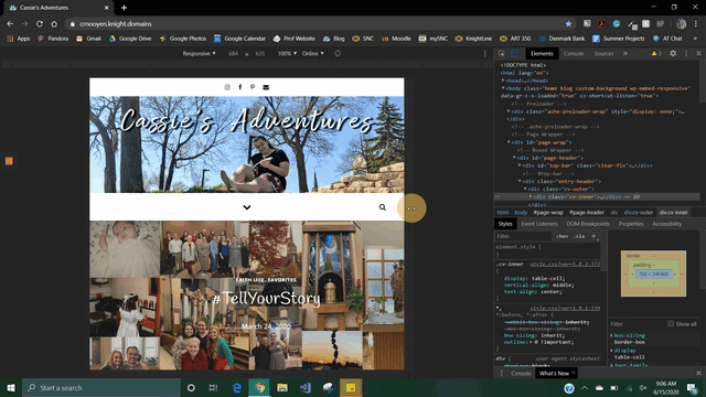
Once inside the inspector, the left side will be the view of your website and the right side will be different elements of your website.

If your screen does not look like the one below, on the top far right next to the small x of the inspector, you can select the three dots and change where the dock (the right side of my screen) is located.

If the device toolbar does not automatically appear, click the device button on the upper right-hand corner (circled below). The keyboard shortcut to show the toolbar, it is Ctrl+Shift+M. This toolbar is what allows you to set the size of the screen to see what it will look like on a specified size screen.

With the toolbar set to the responsive setting, you can manually resize the web page by dragging the bar on the right side of the webpage as seen below.
On the top device toolbar, you can select a predetermined screen size based on common phones or the responsive option which lets you resize manually.

Below are a few examples of what my website looks like on different devices. Click on an image to enlarge it

iPhone X 
iPhone 6/7/8 Plus 
iPad
Capture Screenshots
Another feature of the inspector can be found by clicking the three dots on the device toolbar (closer to the middle of the screen). Two options in this menu are “Capture screenshot” and “Capture full size screenshot”. These options download a picture of your website.

For example, this is what these options look like on my site.


